
Ad Geek Out: British Airways - Super Club to Club World to British Airways Club
Geek out of the Day is British Airways

I’m trying something new - ad geek outs. And this is also my excuse to admire typography. I mean, look at those bold serifs!
Let’s start with British Airways.
There’s something deeply satisfying about watching a legacy brand quietly re‑engineer its product names in public. As a marketer, British Airways’ journey from Super Club to Club World and now to The British Airways Club reads like a thirty‑year case study in how to keep evolving the promise of “premium” without losing the core idea: this is your own little world in the sky.
The old Super Club ad feels wonderfully of its time: big, confident typography, lots of body copy, and a clear “product equals privilege” narrative. You can almost hear the brief - sell the upstairs cabin as a club for the chosen few. It’s transactional and status‑driven: pay more, get more space, get treated differently. The visual language leans on classic cues of luxury and distance from the crowded economy cabin.
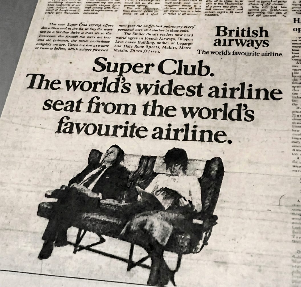
And then here is a 1991 ad.

Fast‑forward to the 1991 ad, and you see the pivot into Club World thinking. The promise is still about separation and comfort, but the narrative shifts from elitism to experience. Instead of simply “better seats”, BA starts selling the idea of a more complete journey: sleep, dining, and service as a coherent product. The layout still carries that dense copy and rational persuasion, but the seed of a more emotional, story‑driven business‑class brand is there.

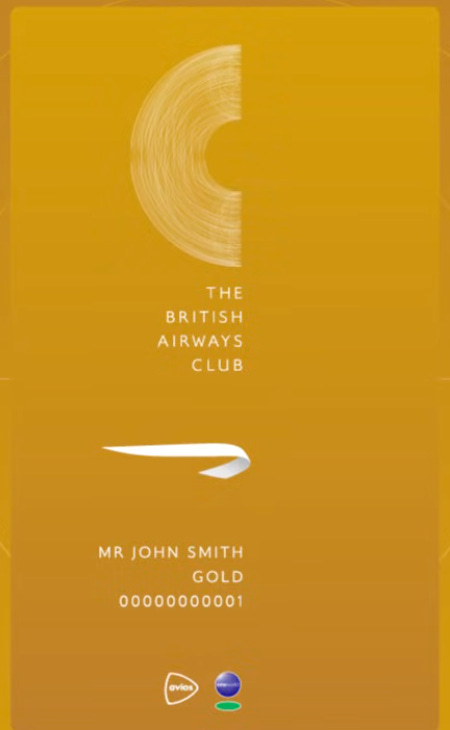
Jump ahead to April 2025 and the rebrand to The British Airways Club, and the modern intent snaps into focus. The name leans hard into master‑brand equity: it’s not just “Club World” as a product line, it’s British Airways putting its stamp on a unified, halo club concept.
Visually, you can see the simplification: cleaner layouts, more negative space, fewer words, and imagery that does much of the heavy lifting. The product story has also matured from “better than economy” to “your own calm, designed space” in a noisy world.
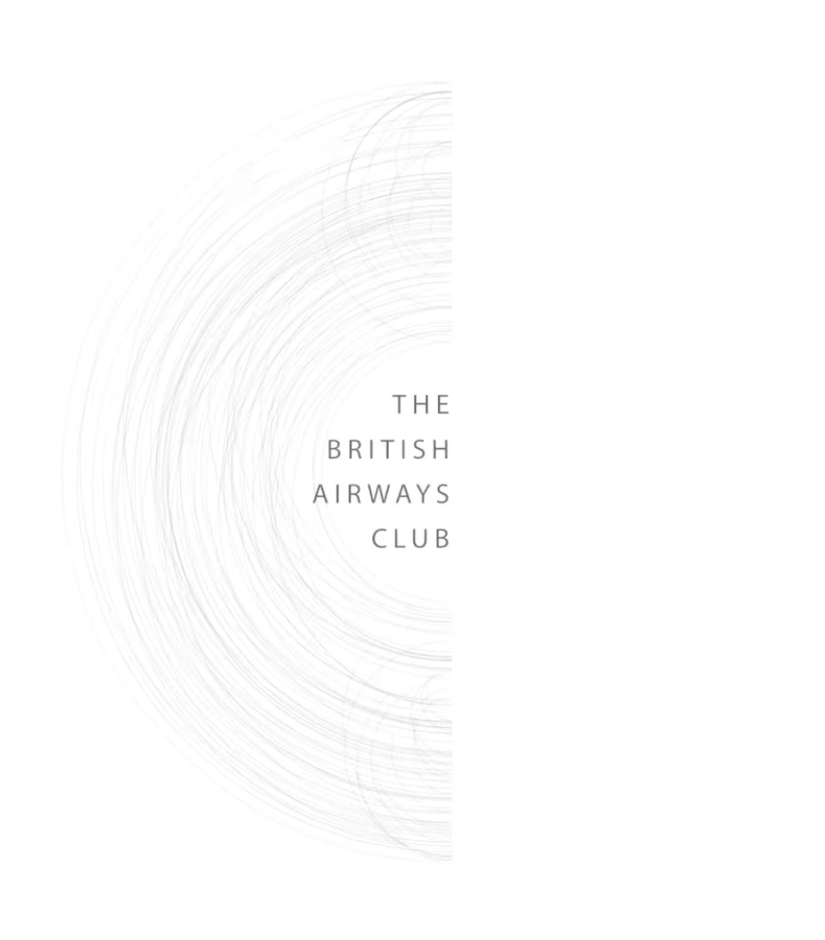
What makes this transition so fun to geek out on is how the language tightens over time while the idea broadens. Super Club was a feature badge. Club World became a destination in itself. The British Airways Club now feels like a flexible platform BA can hang different cabins and experiences on, without rebuilding the brand architecture every time they update a seat.
It’s a neat reminder that naming, visual identity, and product innovation are at their best when they’re evolving together, not in silos.